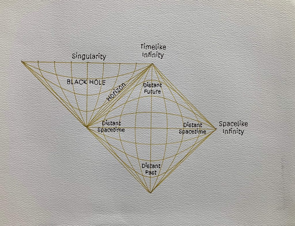
I have been working on custom pen plotter designs in my spare time for a few years. My ultimate goal is to create a hardware, electronic and software solution to produce handwritten type that is indistinguishable from writing done by a real human.

Version 1 of the Plotter Hardware
As a first design, I started with the template of the EEZYxyDraw design available on Thingiverse, uploaded by Carlo Franciscone as an adaption on the commercially available hobby plotter AxiDraw, by Evil Mad Scientist.
This turned out to be a useful exercise to gain familiarity of the firmware and G-Code generation process, while identifying drawbacks of the mechanical design that I could improve upon for my next plotter.
My design looked very similar to the image above, however I replaced the servo motor controlled end effector with a solenoid actuator design. The idea behind this was to speed up the pen lifting and dropping, and maintain a similar downward pressure on the paper when writing to optimise for writing. The solenoid was mostly effective, however as the normally on state was with the pen on the paper, I risked overheating the solenoid with the high duty cycle on longer jobs.
Key drawbacks of this design included:
- Limited page size, while the tabletop real-estate was double this (the secondary cantilever axis needs to extend out backwards when the pen is near to the main axis).
- Secondary axis is too heavy. The inertia of the steel linear rod limits the operating speed. Additionally, this weight results in more pressure/the pen being closer to the page when the cantilever is extended, and low pressure/the pen travel not reaching the page when the cantilever is retracted.
- Solenoid solution was heavy and exceeded the duty cycle spec. This meant I couldn’t leave the plotter unattended on long jobs, and the 3D printed PLA mounting brackets around the solenoid would soften/melt.
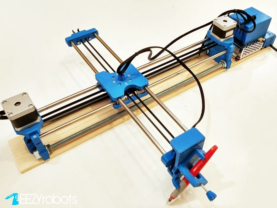
Version 2 of the Plotter Hardware
The second iteration of the plotter made some big improvements:
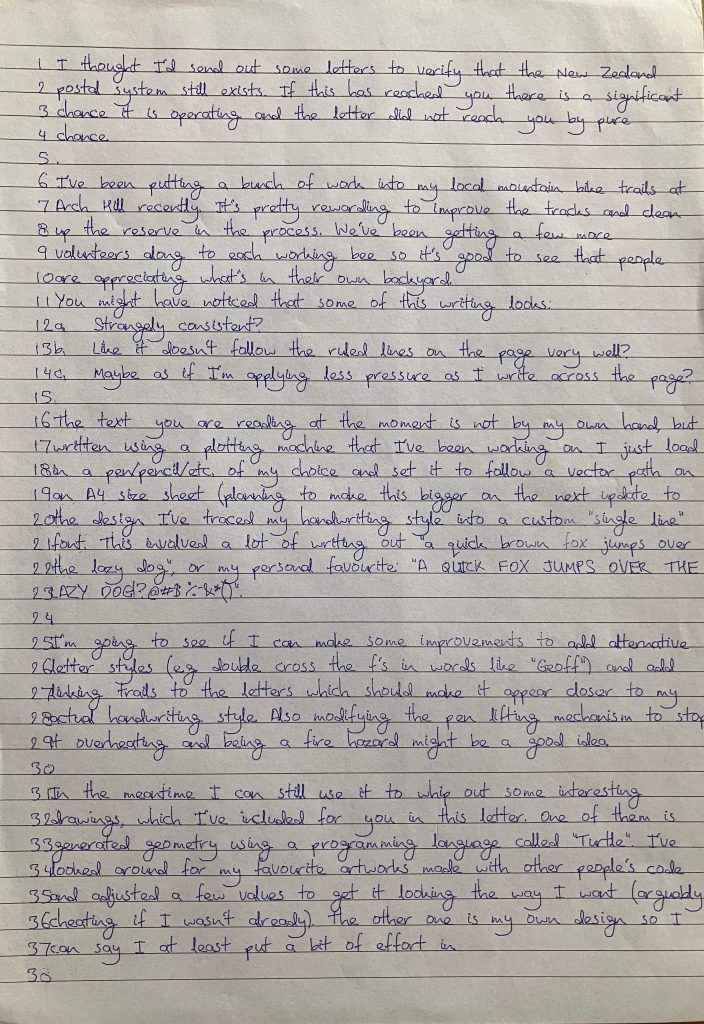
- Solid, mounted linear rails for the Y axis
- A lightweight V-Slot aluminium extrusion for the X axis
- CORE-XY belt kinematics, nicely cancels and torque/racking effects when moving the gantry along the secondary axis
- Simple belt tensioning system using interlocking teeth
- Pneumatic piston for very fast pen movement with tuneable pressure
- Lightweight secondary axis for faster movement, despite an increase from max paper size from A3 to almost A1
- Optical limit switches
- Quick release pen clamp, supporting cartridges with pre-installed collets. This make swapping colours for multi-coloured pieced much less of a hassle
- No more stressing that it’s going to set the house on fire
I ran a quick simulation in SolidWorks FEA to analyse the deflection you would expect to see on the aluminium V-Slot section with anticipated pen pressure forces:
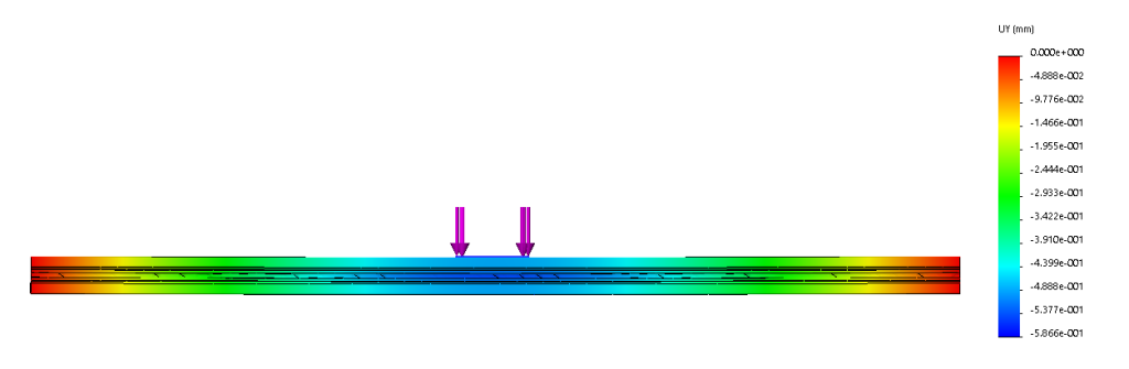
The simulation showed the stiffness was good, with deflection far less than 1mm, which is sufficient for the vertical tolerances of the machine and accomodation in the pen travel. Therefore the aluminium section was a good option for a stiff secondary axis, minimising the inertia of mobile parts so the plotter can accelerate and write faster.
Electronics
Both versions of the plotter use the same electronics and control platform:
- Arduino Mega 2560 with RAMPS 1.4 3 axis (3D printer) stepper motor shield
- 2x A4988 Stepper motor drivers
- 2x NEMA17 stepper motors
- 12V power supply
Control
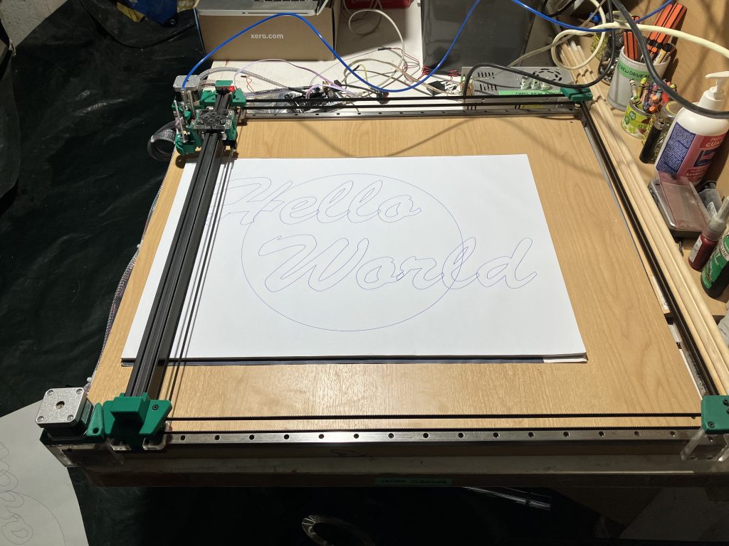
G-Code Generation
- Adobe Illustrator
- Vector to G-Code
These tools took me a while to settle with. I find this much faster and more reliable than Inkscape and G-Code plugins, which were a combination of slow, unreliable or incompatible/out of date. Vector to G-Code has a really nice interface to preview the G-Code output, and add custom commands (e.g. operations when lifting/dropping a pen, or automatically switching colours. An added benefit is the vectors are drawn in the order they were generated, so handwriting is much more fun to watch (sentences are written in order, instead of random “optimised” letters scattered across a page).
Simulating Handwriting
I made a custom single line font for my style of handwriting. This was produced by scanning a sample of my handwriting, tracing vector geometry over the letters, and saving this as .svg. I made a Processing script (also used to create some of the procedural artwork, and able to output .pdf/vectors) to arrange the individual .svg characters like an ASCII font, based on an input .txt document.
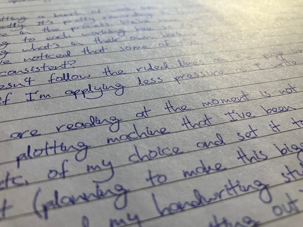
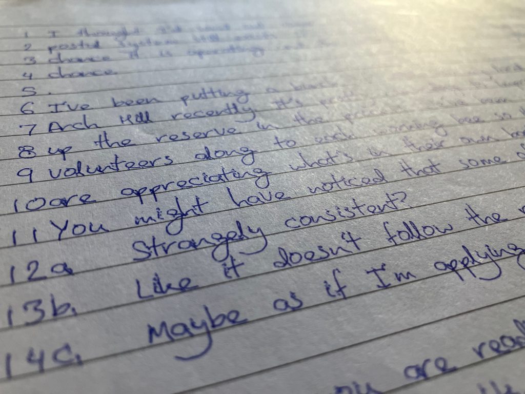
The results can be seen below. From a distance the writing looks believable, however with a bit of inspection there are some give aways:
- No variation. Every instance of the same letter looks exactly the same (e.g. focus your attention to at the y’s).
- Pen impression dimples. The plotter G-Code isn’t sophisticated enough to include a lead in / lead out, and instead takes a slight pause to halt XY movement before lifting and dropping the pen. This leaves ballpoint marks at the start and finish of each vector segment, which should look more like a fading transition.
These are my next steps for improving the realism of the handwriting, most of these are possible by adding some more elaborate modules to my processing script:
- Add procedural variation so every letter is slightly different, to a degree proportional to the target person’s consistency of writing. Variation will also be added to spacing, size and the waviness of the writing as it moves across the page (personally I tend to drift downwards if I’m not writing on ruled paper).
- Support italics, by automatically skewing the control points of the character vectors for letters in italicised words.
- Create custom characters for combinations of letters that are written differently in situ. Examples could be double crossed t’s or f’s, links in cursive writing (e.g. where the tail ends up on a g, j or y depending on whether its at the end of a word, or leading into the next letter).
- Include randomly generated mistakes (crossed out misspellings, written over letters, etc.) at a frequency characteristic of the target handwriting style.
- Extra for experts: Modify the custom font to include lead-in and lead-out paths, so the pen can be already moving across the page as it descends to make contact. These paths could be procedurally linked together (with no pen lift between) to create convincing cursive writing.
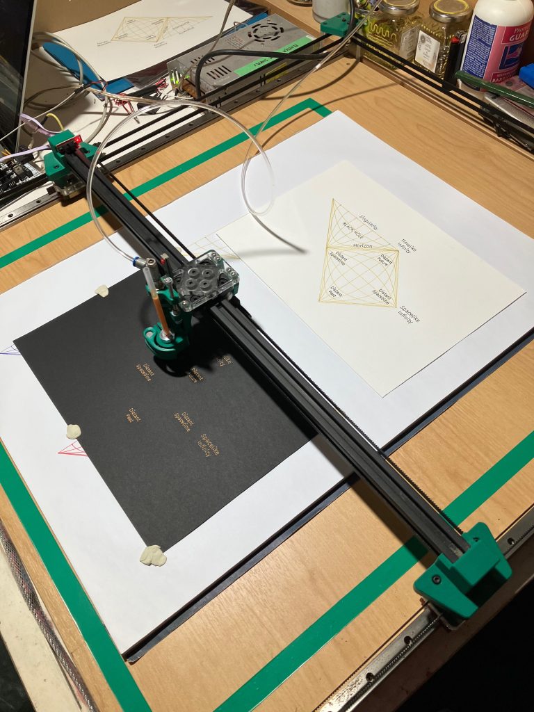
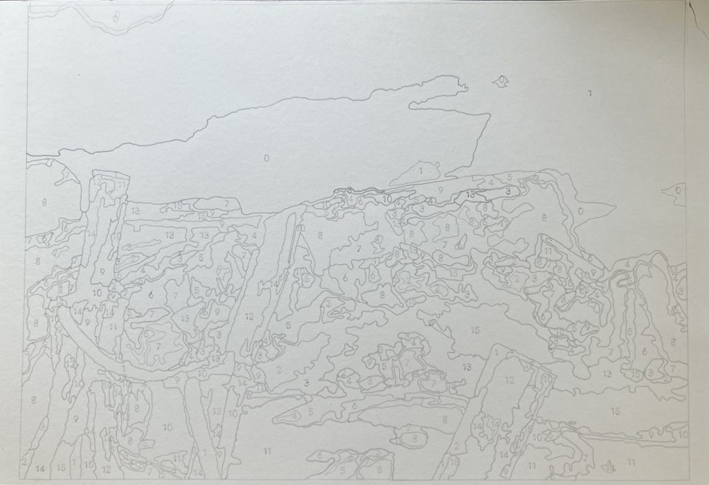
Paint By Numbers Workflow
This was a really fun project. I’m keen to do more of these with photos from some of the interesting places I’ve travelled overseas. The colour palette of a space and how it changes throughout the day/seasons really fascinates me.
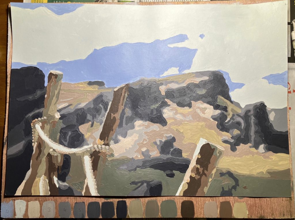
The images below show the process from photo->paint by numbers sketch-> painted piece. This image was captured on a road trip, of a view on Castle Hill, near Arthur’s Pass in New Zealand during the particularly nice summer of early 2022.
I used this very powerful paint by number generator to output an image with about 16 colours and 1000 facets, which was a manageable number to mix and fill in manually on an A3 page. This output is a .pdf, which could just be printed, however the plotter adds a little more character, with soft pencil able to be used on a range of mediums (e.g. card, canvas, etc.).

Plotter Art Pieces
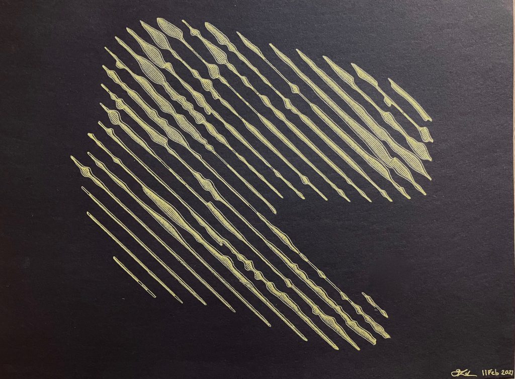
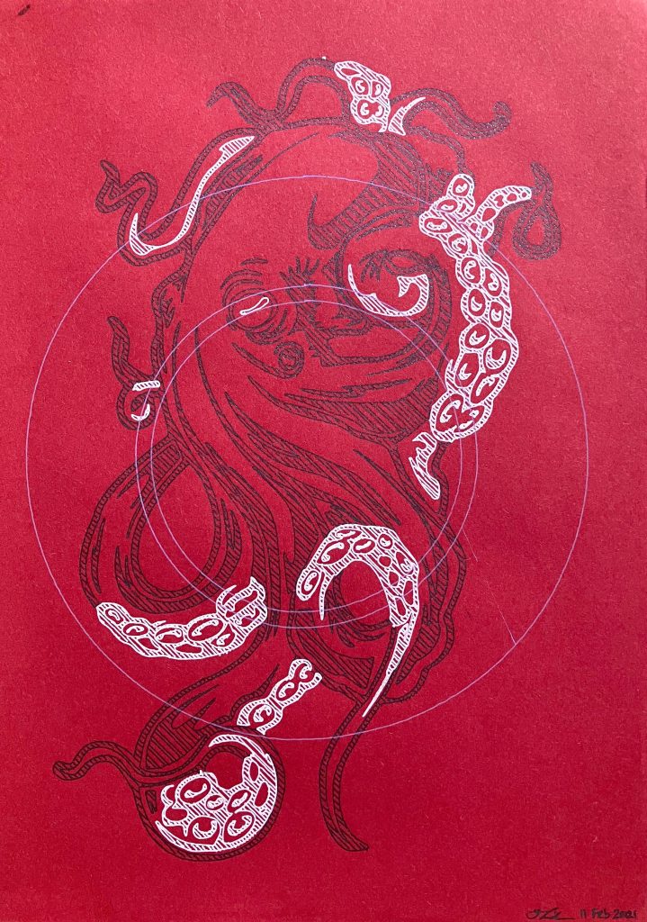
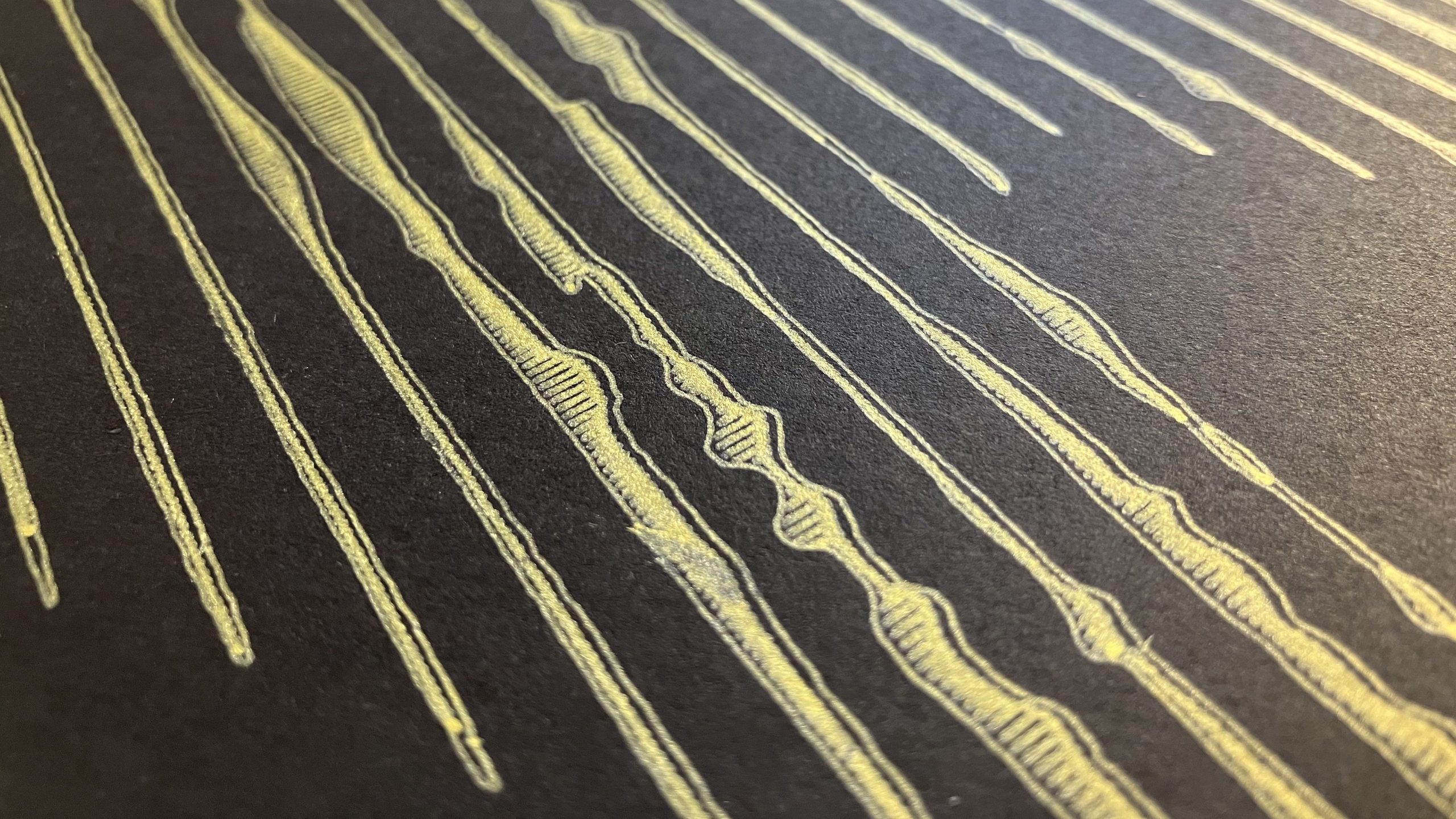
As pretty much any pen cartridge can be loaded into a collet for the plotter to use, it can produce unique results with gel/metallic/coloured pens on various qualities of paper. I want to do more with pencil or crayon or pastels to highlight real texture effects not possible with digital art. The plotter can accomodate 10mm of travel as the drawing medium (e.g. a pencil lead) wears out, although it won’t maintain it’s original sharpness. There are 3 things that I think make plotter art interesting:
- Precision and density. Things a human couldn’t draw, or would take a very long time to draw. That being said, plotter art will still feature charms and imperfections of the process.
- Abstracted procedural designs. Pre-processing an image in a way that can be drawn by a machine and perceived by a human, but not the other way around.
- Lack of sentimentality. As these pieces can be executed relatively quickly, there is room for experimentation that you wouldn’t risk on a masterpiece sketch or painting.